|
|
Post by Tyrannax on Mar 6, 2009 5:34:10 GMT
Agreed  In honor libraraptor.  |
|
|
|
Post by Dinotoyforum on Mar 6, 2009 19:08:28 GMT
It will be done  |
|
|
|
Post by [][][]cordylus[][][] on Mar 6, 2009 22:09:38 GMT
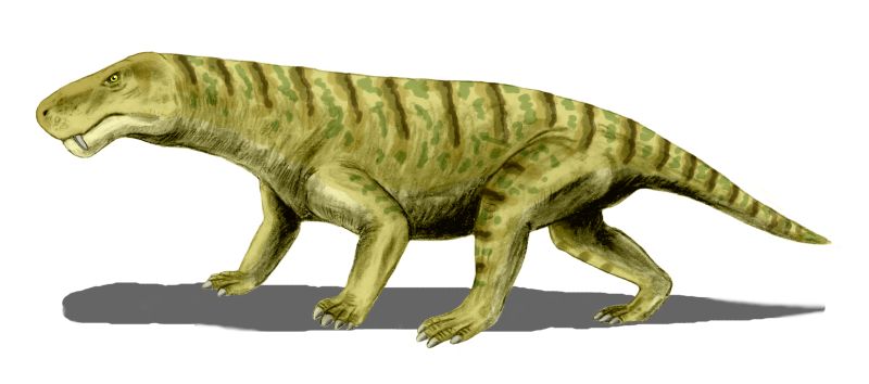
It needs a Procynosuchus.  I have no catalouge photo shot though.... |
|
|
|
Post by Gorgonopsid on Oct 5, 2009 1:40:08 GMT
Dimetrodon, Tylosaurus, Liopluerodon, T Rex. ;D
|
|
|
|
Post by ikessauro on Jan 3, 2011 17:05:29 GMT
Hey DR. Admin.
Don't you think it's time to change the logo? I was thinking, you should change it every year, on January. With so many good new figures coming, won't be difficult to pick up some to be the "stars" of a new DTF Logo...
Just a suggestion...
|
|
|
|
Post by Dinotoyforum on Jan 3, 2011 17:18:40 GMT
I'd be keen to have a new logo/header but my enemy, as always, is time.
|
|
|
|
Post by ikessauro on Jan 3, 2011 18:00:58 GMT
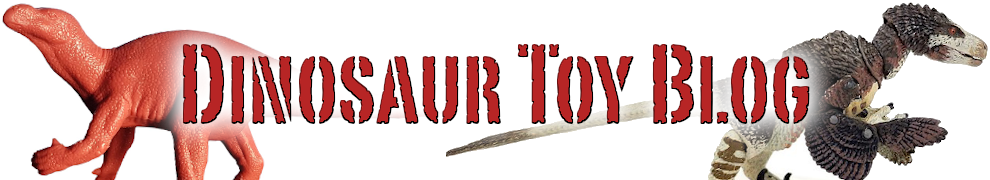
We could help you posting options. I did a quick edition on the current logo and it ended like this  |
|
|
|
Post by Libraraptor on Jan 3, 2011 18:34:11 GMT
Not bad, ikessauro! What do other members think?
|
|
|
|
Post by mightyjptrex on Jan 3, 2011 21:49:05 GMT
Awesome but the Carnegie Carno deserves to be up there! |
|
|
|
Post by Dan on Jan 3, 2011 22:23:49 GMT
Ha, that looks good! Maybe it should also have a noticeable gap somewhere, in honor of Schleich's efforts this year.
|
|
|
|
Post by Dinotoyforum on Jan 3, 2011 22:59:40 GMT
Thanks for the suggestion, I quite like it! With a little rejig I'd be happy to use it as a new header. Would you be able to distribute the figures just a little more evenly, maybe shrink the rex a bit, and somehow fill in the large white space to the right of the text (maybe increase the size of the Styraco). If you could also somehow remove the shadows below the rex and croc, then it would be perfect. |
|
|
|
Post by Gorgonopsid on Jan 3, 2011 23:16:21 GMT
Thanks for the suggestion, I quite like it! With a little rejig I'd be happy to use it as a new header. Would you be able to distribute the figures just a little more evenly, maybe shrink the rex a bit, and somehow fill in the large white space to the right of the text (maybe increase the size of the Styraco). If you could also somehow remove the shadows below the rex and croc, then it would be perfect. Nice logo. Can we get a predinosaur in there? Even an early mammal? |
|
|
|
Post by Dinotoyforum on Jan 3, 2011 23:27:14 GMT
Thanks for the suggestion, I quite like it! With a little rejig I'd be happy to use it as a new header. Would you be able to distribute the figures just a little more evenly, maybe shrink the rex a bit, and somehow fill in the large white space to the right of the text (maybe increase the size of the Styraco). If you could also somehow remove the shadows below the rex and croc, then it would be perfect. Nice logo. Can we get a predinosaur in there? Even an early mammal? I don't really mind what goes into the logo so long as it is prehistoric and the line up includes at least a few dinos |
|
|
|
Post by Gorgonopsid on Jan 3, 2011 23:51:17 GMT
Nice logo. Can we get a predinosaur in there? Even an early mammal? I don't really mind what goes into the logo so long as it is prehistoric and the line up includes at least a few dinos i just thought of them because of the prehistoric feel. |
|
|
|
Post by ikessauro on Jan 4, 2011 3:45:23 GMT
I did another one, tried to distribute the figures equaly and changed some. Couldn't fit the Carnegie Carno in it., the photo angle of the stock pic is bad, the tail seems too long, so as I don't wanted to cut of a part of the tail on the logo, I decided to keep it out. If I use the carnotaurus photo without cutting it looks weird on the logo. Here is the result.  |
|
|
|
Post by sepp on Jan 4, 2011 5:07:53 GMT
I did another one, tried to distribute the figures equaly and changed some. Couldn't fit the Carnegie Carno in it., the photo angle of the stock pic is bad, the tail seems too long, so as I don't wanted to cut of a part of the tail on the logo, I decided to keep it out. If I use the carnotaurus photo without cutting it looks weird on the logo. Here is the result. I actually like it quite a lot! The only thing I would suggest is having the two leftmost figures facing right, as opposed to just the styracosaurus facing right. I think that would draw the eyes to the center better - but aside from my personal anal retentiveness, I really like the layout and choice of figures |
|
|
|
Post by Dinotoyforum on Jan 4, 2011 10:04:35 GMT
I did another one, tried to distribute the figures equaly and changed some. Couldn't fit the Carnegie Carno in it., the photo angle of the stock pic is bad, the tail seems too long, so as I don't wanted to cut of a part of the tail on the logo, I decided to keep it out. If I use the carnotaurus photo without cutting it looks weird on the logo. Here is the result. I actually like it quite a lot! The only thing I would suggest is having the two leftmost figures facing right, as opposed to just the styracosaurus facing right. I think that would draw the eyes to the center better - but aside from my personal anal retentiveness, I really like the layout and choice of figures Agreed, if you can reverse the Inostrancevia, and also lower the Miragaia a tad so the spines don't interfere with the tagline, I'll use it |
|
|
|
Post by Megaraptor on Jan 4, 2011 10:21:13 GMT
I am happy with this new logo, but yes, turn the Inostrancevia around, swap the T-rex and the Miragaia around, then replace the T-rex with the Carnegie Carnotaurus and the Miragaia with the CollectA Hatzegopteryx. It'd be great if we had a figure from all the companies that produced figures this year up there, but [insult directed at Bullyland and Schleich] I think we've already got all the noteworthy companies up there [/insult directed at Bullyland and Schleich]! Thanks for the suggestion, I quite like it! With a little rejig I'd be happy to use it as a new header. Would you be able to distribute the figures just a little more evenly, maybe shrink the rex a bit, and somehow fill in the large white space to the right of the text (maybe increase the size of the Styraco). If you could also somehow remove the shadows below the rex and croc, then it would be perfect. Nice logo. Can we get a predinosaur in there? Even an early mammal? Umm, surely Inostrancevia is both a pre-dinosur and an early mammal (or mammal-like reptile)? |
|
|
|
Post by ikessauro on Jan 4, 2011 16:08:04 GMT
I made the changes...  |
|
|
|
Post by Himmapaan on Jan 4, 2011 17:46:49 GMT
Bravo, Ikessauro. |
|


![[][][]cordylus[][][] Avatar](http://files.sharenator.com/Troll_Face_U_MAD_RE_wrestling_1-s407x405-126802.jpg)