|
|
Post by Horridus on Jun 29, 2011 16:16:31 GMT
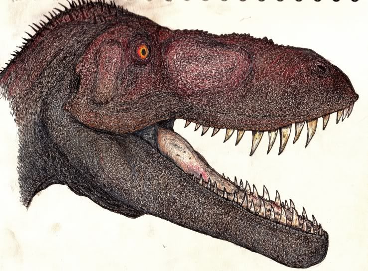
I decided to start a new thread rather than giga-bump the old one. It helps that the old one has lots of stuff I'd rather people forgot.  (Although I might add that given the ridiculous number of highly talented Actual Artists we have here now, I feel pretty ashamed to show anything at all!) Anyway, here's a new portrait of Torvosaurus tanneri, based on a photo of a skeletal mount that Brian Switek linked to on Twitter. The scanner did it no favours...the colours blend a lot better in real life, I swear!  |
|
|
|
Post by Blade-of-the-Moon on Jun 29, 2011 17:55:44 GMT
Scanners never do..much the same for most cameras...but this looks pretty darn good to me still. Though me and color are generally mortal enemies I like when someone else makes piece with it .... ;D
|
|
|
|
Post by crackington on Jun 29, 2011 18:24:49 GMT
Nowt wrong with that Horridus, its cool.
|
|
|
|
Post by arioch on Jun 29, 2011 18:32:31 GMT
Nice! I really like the texture, specially in the snout and the tongue. Great job.
I you seek any advice, I think you should define some focus light in the eye, they would look much more alive. Sometimes a single white dot in the darker area is enough.
How long did it take? there are tons of -well executed- details.
|
|
|
|
Post by Himmapaan on Jun 29, 2011 20:44:27 GMT
Yay! I was wondering when we'd see new drawings from you. Great stuff; I like the discoloured teeth best, for some reason. I agree with Arioch about a highlight in the eye. A dot of white acrylic would just do the trick (or in future, if you prefer, you can leave the white of the paper showing through instead when colouring the eye).
More please.
|
|
|
|
Post by Horridus on Jun 29, 2011 21:45:36 GMT
Thanks for the comments all, and the tips Arioch & Himmapaan. Will bear in mind for the future. Velociraptor re-do next.
|
|
|
|
Post by Griffin on Jun 29, 2011 21:47:41 GMT
Nice! I was hoping you would start drawing again. Love all the detail work.
|
|
|
|
Post by Horridus on Jul 6, 2011 17:37:55 GMT
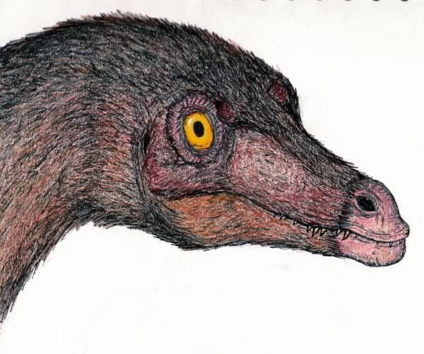
For your consideration: a Velociraptor in the same vein. Probably needs more work. If I can be bothered (is it worth it?)...  |
|
|
|
Post by arioch on Jul 6, 2011 19:50:42 GMT
Fantastic. Very realistic feel.
And now the anal (;D): I think the back of the skull should be narrower compared with the snout (left eyebrow more precisely). Sure, its wider than the snout but a bit less. I could have a wrong impression because of the feather covering though. Anyway it could look more homogeneous by adding covering over the right eye.
|
|
|
|
Post by Himmapaan on Jul 6, 2011 21:18:12 GMT
Probably needs more work. If I can be bothered (is it worth it?)... What a question. Of course it is. It's looking great. |
|
|
|
Post by Griffin on Jul 6, 2011 21:27:56 GMT
Nice one. I like the angle you did it at.
|
|
|
|
Post by Horridus on Jul 6, 2011 22:41:56 GMT
Arioch: I thought myself that maybe a little of the other eye should be showing...but it shouldn't be any narrower. Wider, if anything. Velociraptor did actually have some degree of binocular vision - not on a par with Tyrannosaurus, but notable nonetheless.
Niroot: any suggestions as to what to do next?
|
|
|
|
Post by mmfrankford on Jul 6, 2011 23:35:03 GMT
Love your work. The textures are great and I love the raptor's eye.  |
|
|
|
Post by arioch on Jul 6, 2011 23:44:10 GMT
Show a bit of the other eye would be nice. My biggest concern is the left eyebrow which seems too bushy compared with the other one. The difference on the wideness of snout and rest of the head isn´t really that big.They´re still far from tyrannosaurs typical shape:  |
|
|
|
Post by Horridus on Jul 6, 2011 23:53:49 GMT
You're right. I do happen to own that replica - in fact the drawing was based on it! ;D My sketch-fu is alas weak.
|
|
|
|
Post by Himmapaan on Jul 7, 2011 0:04:32 GMT
I thought by your earlier comment that you had something in mind to proceed with yourself, so I was looking forward to seeing that.  Otherwise, I don't think there's anything else to add; it honestly looks great! I think I see Arioch's point about the left 'eyebrow' appearing slightly larger, though it probably can't be altered now; but at all events, it's a nitpicky issue and it wouldn't have occurred to me to mention it if Arioch hadn't.  (Observe me passing the buck ;D) If you did want to do anything else, perhaps you could darken the outer iris just a tiny bit more, particularly on the bottom area opposite the highlight. It is only because it's a close-up portrait and the eye is such a strong focus that I suggest it. But really, it's perfectly fine as it is.  One could too easily end up overworking something to its detriment. |
|
|
|
Post by Horridus on Nov 8, 2011 21:42:52 GMT
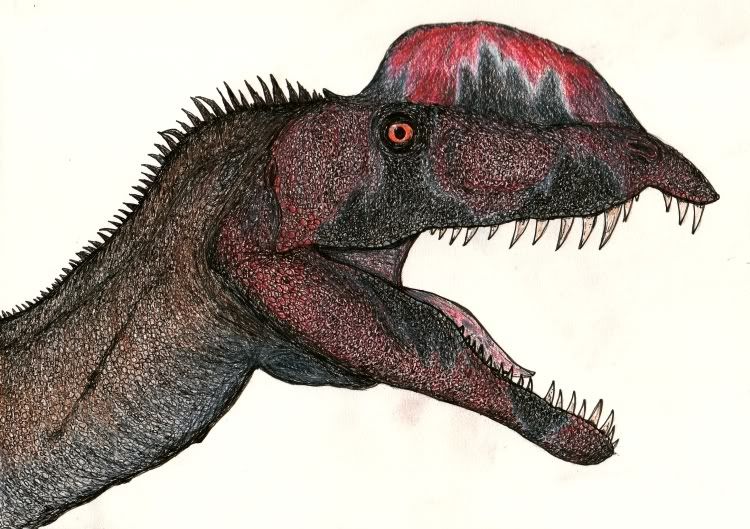
I've coughed up a new pencil atrocity!  How I have the nerve to criticise other people's work on here is beyond me. Anatomy wise, I'm not sure about the neck. In my defence, I based it on an old mount. Actually, that's a terrible defence. |
|
|
|
Post by Griffin on Nov 8, 2011 23:57:07 GMT
Saw this on facebook. Nice one. I really like the colors.
|
|
|
|
Post by arioch on Nov 9, 2011 21:29:51 GMT
Great work with the patterns and scales detail! You should try some full body dino.
|
|
|
|
Post by Horridus on Nov 10, 2011 15:20:55 GMT
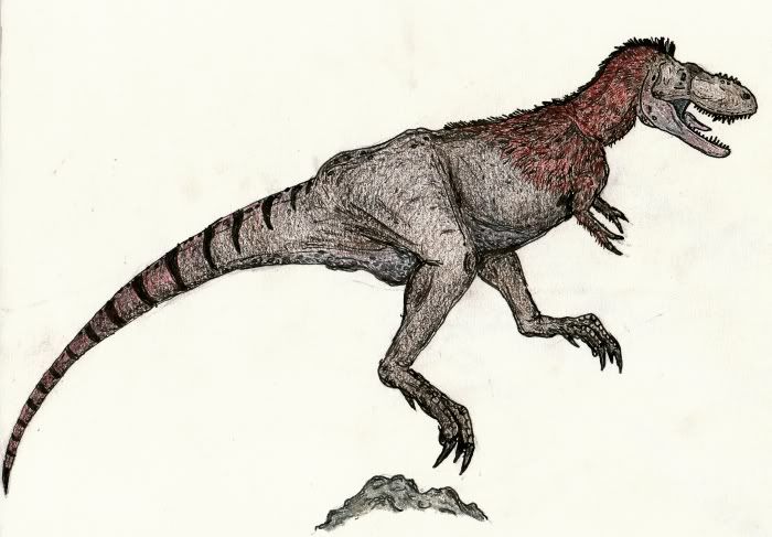
Great work with the patterns and scales detail! You should try some full body dino. I did draw this once, based on Jane. Was just a quickie. Will have another pop at a large T. rex like 'Sue' or AMNH 5027 at some point...  |
|