|
|
Post by Horridus on Feb 3, 2011 13:27:01 GMT
Looks exactly like the one in the movie (right down to the wrong feet ;D). Nice work once again.
|
|
|
|
Post by yankeetrex on Feb 11, 2011 22:27:44 GMT
|
|
|
|
Post by Permiantriassic on Feb 11, 2011 22:59:23 GMT
aww its adorable he has that reptilian stare my lizard gives me ;D
|
|
|
|
Post by hkhollinstone on Feb 12, 2011 12:42:08 GMT
He's gorgeous!
|
|
|
|
Post by Griffin on Feb 13, 2011 23:04:41 GMT
Awesome!
|
|
|
|
Post by yankeetrex on Mar 6, 2011 16:36:17 GMT
Just wanted an opinion on the final color scheme.....one is vibrant 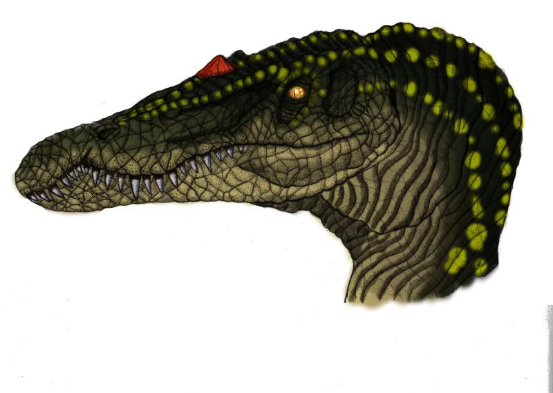 The other, not so much..... 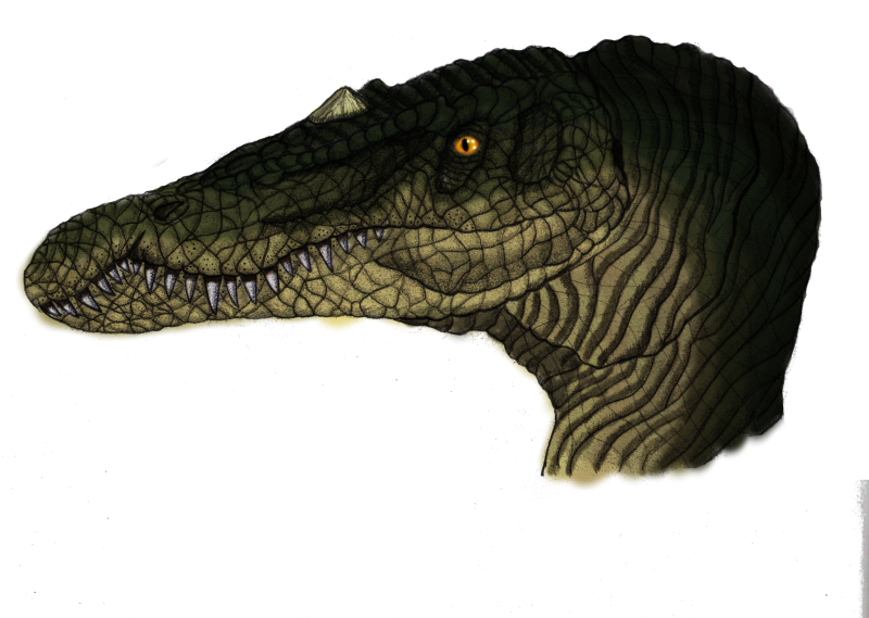 EDIT: i adjusted the eye, i like the thinner pupil, but im open to returning to the old one, what do you think? |
|
|
|
Post by Horridus on Mar 6, 2011 17:13:18 GMT
Vibrant all the way for me.
Any reason you went for a slit pupil (or just aesthetics)?
|
|
|
|
Post by yankeetrex on Mar 6, 2011 17:33:03 GMT
Well, i'm not sure actually, i do like the aesthetic of the split pupil, but i'm basing the idea off of a crocodilian. do most studies show that baryonyx or pretty much any of the Spinosaurids had circular bird like pupils? Its my understanding that split pupils are for primarily nocturnal animals.
|
|
|
|
Post by Horridus on Mar 6, 2011 18:03:16 GMT
People have no idea what sort of eyes they had, really.
Looks like you changed the eye on the top one - I must say I preferred it with the same eye as the bottom one. Looks more realistic.
|
|
|
|
Post by Blade-of-the-Moon on Mar 6, 2011 18:56:48 GMT
I have to second that..it looks softer and more realistic with the larger pupil. I'm also in favor of the vibrant one..the bottom one looks too much like a crocodile and the ridges and such lack depth and kinda run together without the lighter colors to set them off.
|
|
|
|
Post by hkhollinstone on Mar 7, 2011 17:31:54 GMT
Vibrant all the way for me. Same here, looks fabulous  |
|
|
|
Post by yankeetrex on Mar 26, 2011 5:25:29 GMT
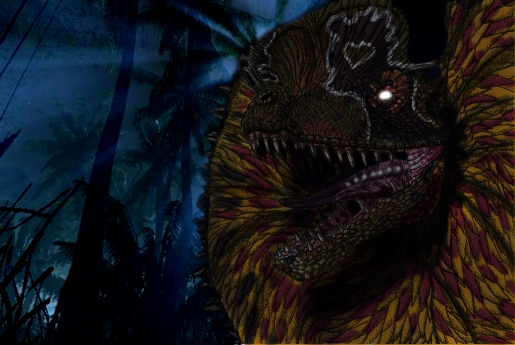 tried to add a snarl notch that would match the actual notch on a real dilophosaurus skull, not to successful |
|
|
|
Post by Blade-of-the-Moon on Mar 26, 2011 6:08:33 GMT
I liked this piece on DA ..but it's much better with a background instead of the black area.. nice job ! ;D
|
|
|
|
Post by hkhollinstone on Mar 26, 2011 11:47:16 GMT
It's fabulous!  |
|
|
|
Post by Horridus on Mar 26, 2011 18:02:55 GMT
Very cool. If you're going to go all-out JP and give it a frill, though, I really wouldn't worry about the subnarial gap.
|
|
|
|
Post by yankeetrex on May 10, 2011 5:43:50 GMT
Alittle something im working on.......... 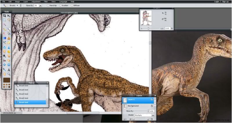 |
|
|
|
Post by Blade-of-the-Moon on May 10, 2011 6:24:45 GMT
Basing it off the Sideshow statue I assume ? ;D
|
|
|
|
Post by yankeetrex on May 11, 2011 13:27:14 GMT
yes sir, i really wish that they would have continued with the jurassic park line, but we have been getting some amazing dinosauria pieces......
|
|
|
|
Post by Blade-of-the-Moon on May 11, 2011 16:23:45 GMT
I think the JP piece just didn't get the respect it deserved...paint-wise mostly. Adrian did his best sculpting..but he's MUCH better at scientific recreations of Dinosaurs. They should have just hired Galileo to make it..that would have fixed the sculpt to perfection...but the paint work would prob still have been bad..just not as noticeable with a great sculpt.
|
|
|
|
Post by yankeetrex on May 13, 2011 13:40:07 GMT
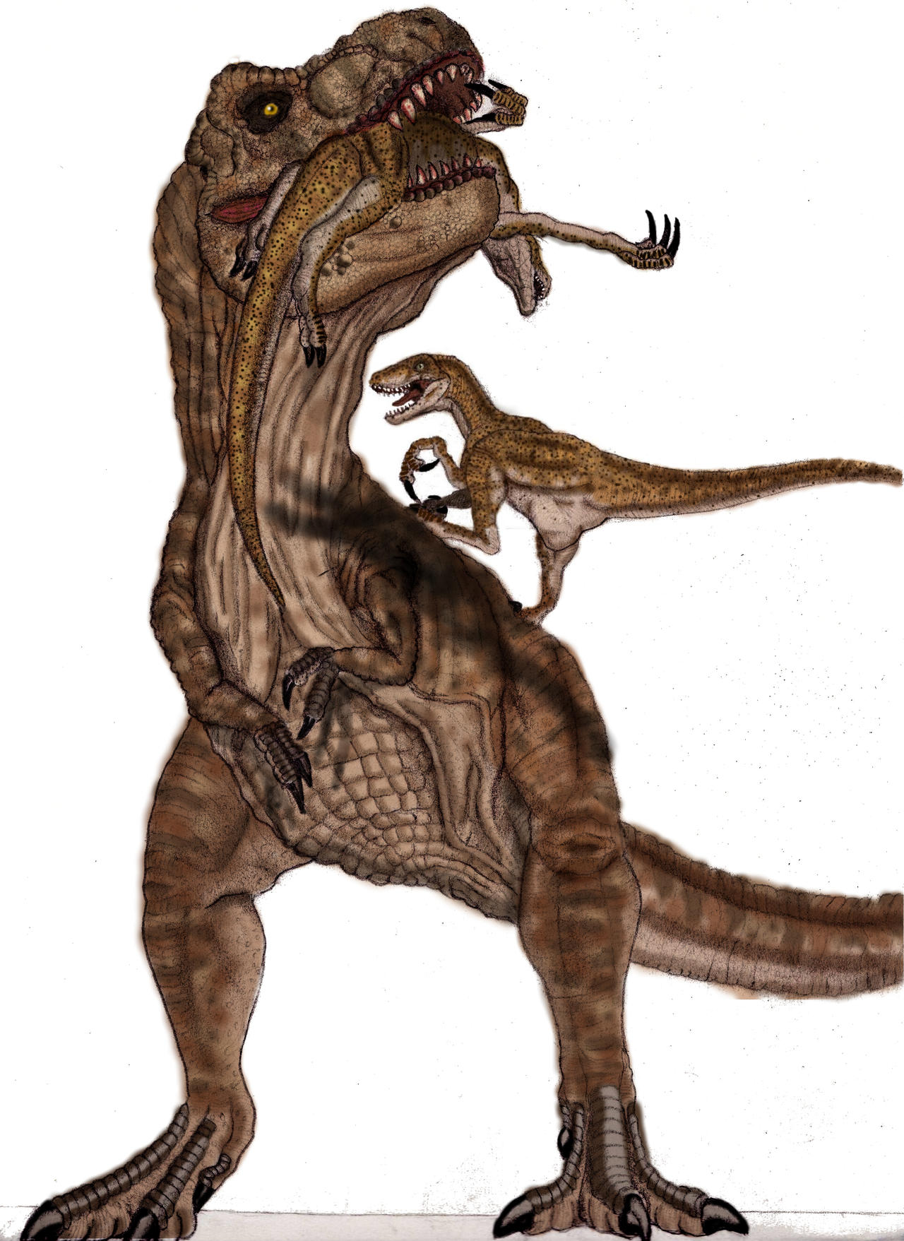 I agree, i wish that they would just release unpainted versions so that we could get the work done the way we want it |
|